
Monday, February 06, 2006
Heres a Quarter Utah Call Someone Who Can Design
Seven years ago the United States Mint started to redesign our money. Quarters began to have individual state designs on them. The first ones were very cool and designed to represent the state. I think most of them are quite good.
Recently Utah released their final designs. Wow
Who chose these designs? Mrs. Adams 4th grade at Provo Elementary class? It looks as though there were few entries to choose from so they chose the only three entries.
The Beehive
This has turned into another Mormons vs. Non-Mormons battle. Oh brother
Beehives have about as much to do about the LDS religion as L. Ron Hubbard does (absolutely nothing). Brigham Young thought that it represented industry and working together for the greater good so he used it as a state symbol. Non-Members seem to think it to be the ultimate symbol of Mormonism. To non-Mormons it might have well been a swastika on the quarter. My complaint is they could not have made the beehive more boring in appearance. 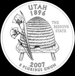
Golden Spike
It is true that the transcontinental railroad met in Utah in 1869 unfortunately the design says 1896 the day Utah became a state. Promontory Point is just a desert wasteland now and really isnt as important to Utahs identity as other designs. It just seems kind of silly. 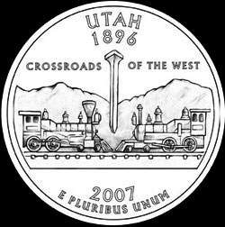
The Snowboarder
Yeah this does nothing for me either. It looks like a drawing out of a 1970s LDS New Era magazine.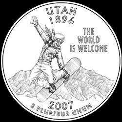
Fragile Arch
This one showing the natural wonders that is Utah. I feel that this one represents the state the best but of course Governor Huntsman put the kibosh on it. It is only good enough for most advertising about Utah.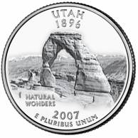
The Governor and Utah Travel Council should pull their collective heads out of their behinds and chose something marketable. These three designs suck
Learn More about these crappy designs here.
Links to this post:
From the polls I am seeing it looks like the Golden Spike is the favorite. The crossroads of the west built by the hands of hard working Americans. Oh wait, the white workers would collect their paychecks, get drunk and quit. So the Union Pacific hires 10,000 Chinese workers for half of what they were paying the white men and working them twice as many hours. Over 2,000 died bring the tracks from California. Do you see any Asians in that famous picture?


